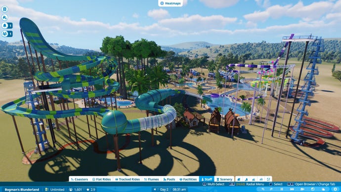
Theme park management sim Planet Coaster was all about making roller coasters that would push your park guests to the edge of puking up their overpriced burgers while making sure the excitement levels of your twisting rides remained high. Planet Coaster 2 wants to do that again, but this time adds water parks into the mix, with slides to design, pools to plop down, and raft rides that you can click together to form ambitiously speedy spirals. You can feel some creative pride when you look down on the watery wonderland you’ve made with these tools. But you may also wonder if it was worth the effort. As a newcomer to Planet management games, I’ve found this slippy sequel fiddly, cumbersome, and poorly explained.
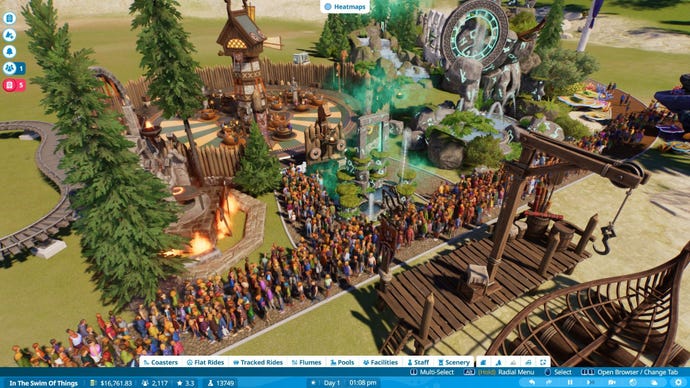
A big selling point is the modular building you can do. Basically, you get a library of individual pieces included in the menus, and you can click them together to create new buildings in which to house the toilets for your guests, the changing rooms, or pizza stands. This goes for decorating your park too, with a big chunk of the menus devoted to trees, rocks, and props themed on Vikings or classical architecture. Not only this, but each water slide and coaster can be built piece by piece, twisting and turning over the heads of your guests according to your whims.
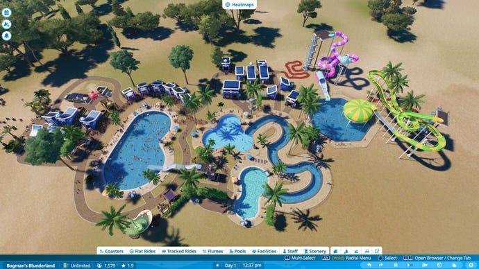
It’s a good idea on paper. I enjoy pulling and pushing together winding vomit comets, or manipulating water flumes into increasingly perilous spirals – they feel like a good use of your creative time. But jamming basic drink shops into prefab casings to make them a little more presentable, by contrast, feels like fiddlesome busywork hampered by menus that are a nuisance to navigate.
For context I normally love building and creating stuff using game tools (I’ve made entire maps in Halo’s Forge mode, for example). And an earlier hands-on with this soaking sequel had me excited about making my own funloving aqualand. But on a deeper playthrough there’s something fundamentally unintuitive to me about the menus and user interface, which makes learning and understanding the game’s many quirks a pain. At any moment in Planet Coaster 2, I am deeply unsure of what part of the screen I need to click.
There are YouTubers out there doing the good work of explaining all this stuff, but it doesn’t stop the meter tweaking and box ticking from feeling like a chore to me. Those more dedicated to the waterpark of their dreams (or those more familiar and patient with the UI of Frontier’s other Planet games) will get more out of it. But even they might wonder if it’s worth losing many other themed pieces from the first Planet Coaster, which have been left out in this sequel, probably to ensure that they can be later sold for DLC.
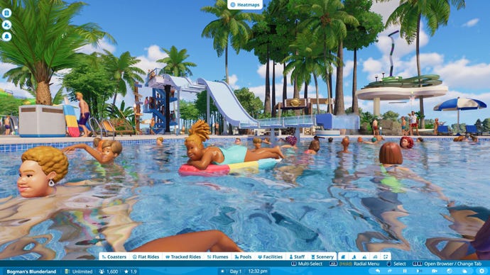
Still, you don’t have to actually clickybuild things yourself. You can instead press a big button labelled the “Frontier workshop” to scroll through the creations of other players, all available to download. You’ll find huge coasters that dive into the mouth of an Arrakis sandworm, for example, or an ornate Roman bath house facade, ready to be filled with the wave pools and diving docks of your choice. But even this archive of filtersome goods feels like a clunkier version of what players from the previous game enjoyed via the Steam workshop.
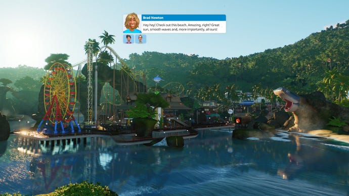
The campaign mode (often the place where management games like to disguise their tutorials) spends more time indulging whimsical characters having family-friendly small talk than actually showing you the ins and outs of the UI. Characters will share jokes, flirt, and – for some reason – establish deep lore about the Planet Coaster universe. I understand the desire to add some cartoon personality to a genre that is mostly about numbers and big picture planning. But it also slows down the flow of useful information (your goals or learning objective) as you wait for a surprisingly large cast of characters to finish their little skit. You can skip their chatter, but then you’ll be left none the wiser as to why you’re doing any of the stuff summarised in the objectives menu.
In the end, most campaign missions are not really learning exercises at all. Or, if they are, they become increasingly hands-off, inviting confusion and a lot of menu-exploring guesswork. It’s often unclear what the game wants from you, and the freedom it gives you in these scenarios varies so much that you run up against artificial limitations as you search for the solution. You might be tasked to complete a rollercoaster which has a few missing parts. But you can’t edit or delete parts of the existing track, only add new parts. Another task might have you place down a new roller coaster. But you’ve already filled all available space with flat rides from a previous task. Can you buy new land? No, that’s not allowed yet. The real solution is to individually bulldoze each tree and each rock in one tight spot and squeeze the ride into the space left behind.
This holding back of certain features is probably the result of the campaign trying to teach you its various tools of building in a piecemeal way. But it more often just ends up feeling like the game wants you to play “the right way” without explicitly saying what that right way is. Imagine an art teacher putting 30 brushes in front of you and saying: “Art is all about creativity! Let’s learn!” then when you reach out for the broad bristly brush, they say: “Not that one.”
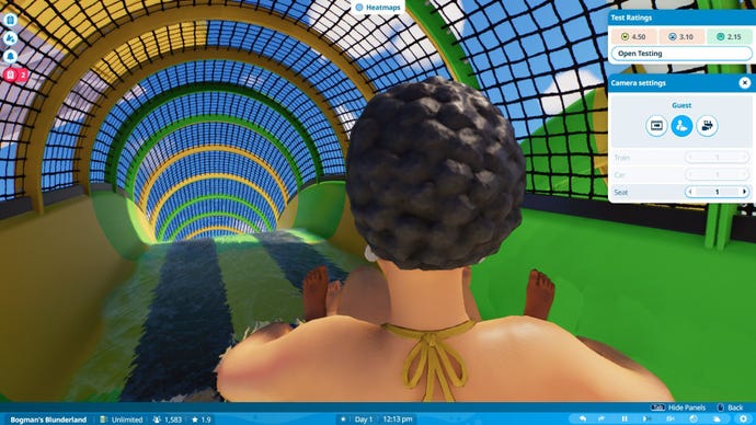
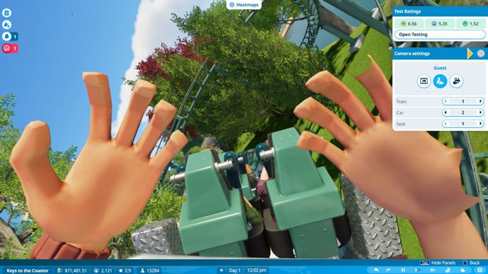
The game’s penchant for micromanagement takes on some tedious aspects elsewhere, like having to navigate into the menu of every guest services kiosk to click “open” before it will actually do its job. What does this extra step add to the game? It’s only three clicks, sure, but it’s the same joyless three clicks every time. It makes sense for the rides to be tested before you open them, but does a burger stand really need a grand opening every time you build one?
All the fiddliness of the campaign caused me to abandon it early in favour of the sandbox mode, where you can mercifully give yourself infinite cash, and choose whether or not you want to bother with power and water filtration networks. By default you basically have to place these generators and pumps throughout the park to spread a colour-coded glow that denotes your pools and rides have sufficient electricity and clean water (imagine the underlying water and electricity maps of Prison Architect, but with less need to be precise). I played with these switched on, because I like to think about this stuff in layers and look at the game’s visual heatmaps that show where your power network is lacking, or where the pools are likely full of piss. But you can turn these layers of the game off completely, at which point your sandbox park will just work. An inviting prospect to those who just want to make stuff look cool.
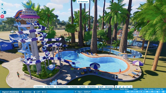
I messed about in sandbox mode far longer than I suffered the campaign. Here, I enjoyed making winding paths for guests and dealing with crowded bottlenecks by enticing them down another route lined with stalls full of hot dogs and inflatable toys. I was especially happy when I planted down a huge set of jungle trees by accident, then embraced it to create a “swamp” of snaking pools that guests could wade through to discover my newly launched flume ride. In these moments, the creative potential of the sim really shines, and I could see exactly why people put so much time and effort into their Workshop creations.
But, as time went on, the weight of the poor user interface eventually crumpled my enthusiasm for that too. I’ve been playing management games for a long time, and it feels odd that Planet Coaster 2 should make me feel so stupid. The method of building something as simple as a set of restrooms is elaborate and sticky, and requires so much returning to a side menu to resize grids or twiddle the angles that my brain just starts to reject it. Like I say, more patient Planetfans might feel the pain of this troublesome interface less keenly. If that’s you and you’re willing to risk a face full of chlorinated slider bars, then dive right in. But for new players like me, it’s a painful belly flop.


